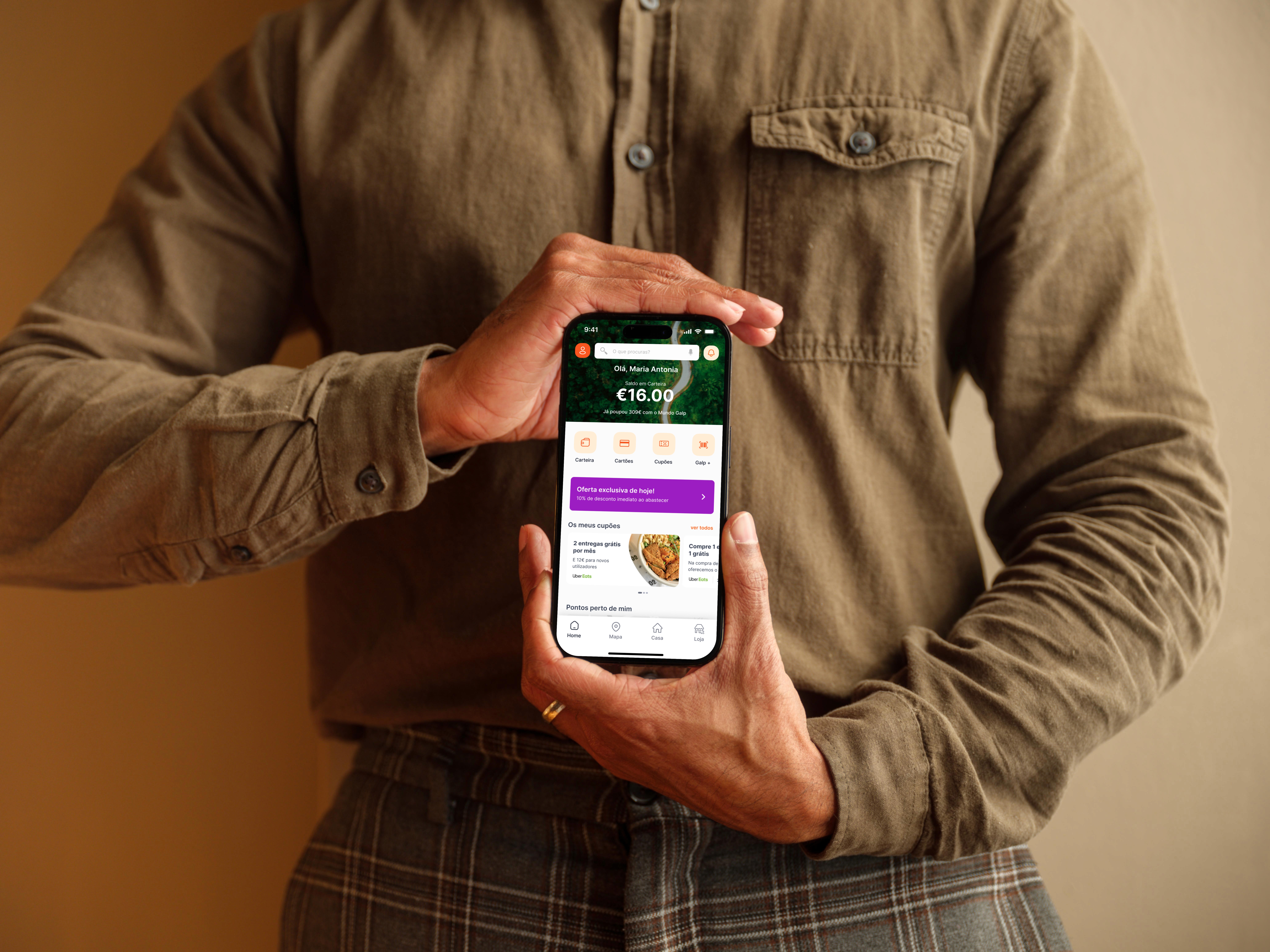
GALP
Engagement increased by 35%with a simple navigation
Role
UX Designer
Timeline
2022 - 2023
Team
Product Owner
UI Designer
Development Squad
QA specialist
Stakeholders
Skills
Ux Strategy
Product Designer
User Research
Tools
Overview
Galp is a Portuguese multinational energy company operates on four continents and is a key player in the energy market of the Iberian Peninsula.
The Mundo Galp app is a tool for Galp customers that allows them to accumulate balance in the Galp Wallet. It supports 400k of users monthly helping to find service stations and electric charging points, manage energy contracts, track consumption and for electric vehicles, it enables charging and payment directly in the app. Accessible via both its website and mobile apps (iOS, Android).
Problem Statement
Users had difficulties finding important information, such as their contracts and discount coupons.
This caused frustration, negative reviews, low adoption, and a high volume of support calls from users looking for information that should be easy to access inside the app.
Goals
Improve the discovery of essential information
Reduce negative reviews
Increase app adoption and engagement
Reduce Volume of support calls

User Research
The lack of cohesion between platforms used to run events made the experience confusing and frustrating.
The app looks like simple at the first moment but there was a big problem hidden within. To understand where the experience was failing I immersed myself to identify the core of our problems, let me show you how i came to discover that problem...
App Store Reviews and Support Tickets
I started by reviewing App Store and Google Play reviews, as well as support tickets, and a clear pattern quickly emerged: many users struggled to find key information, such as contracts and discount coupons.
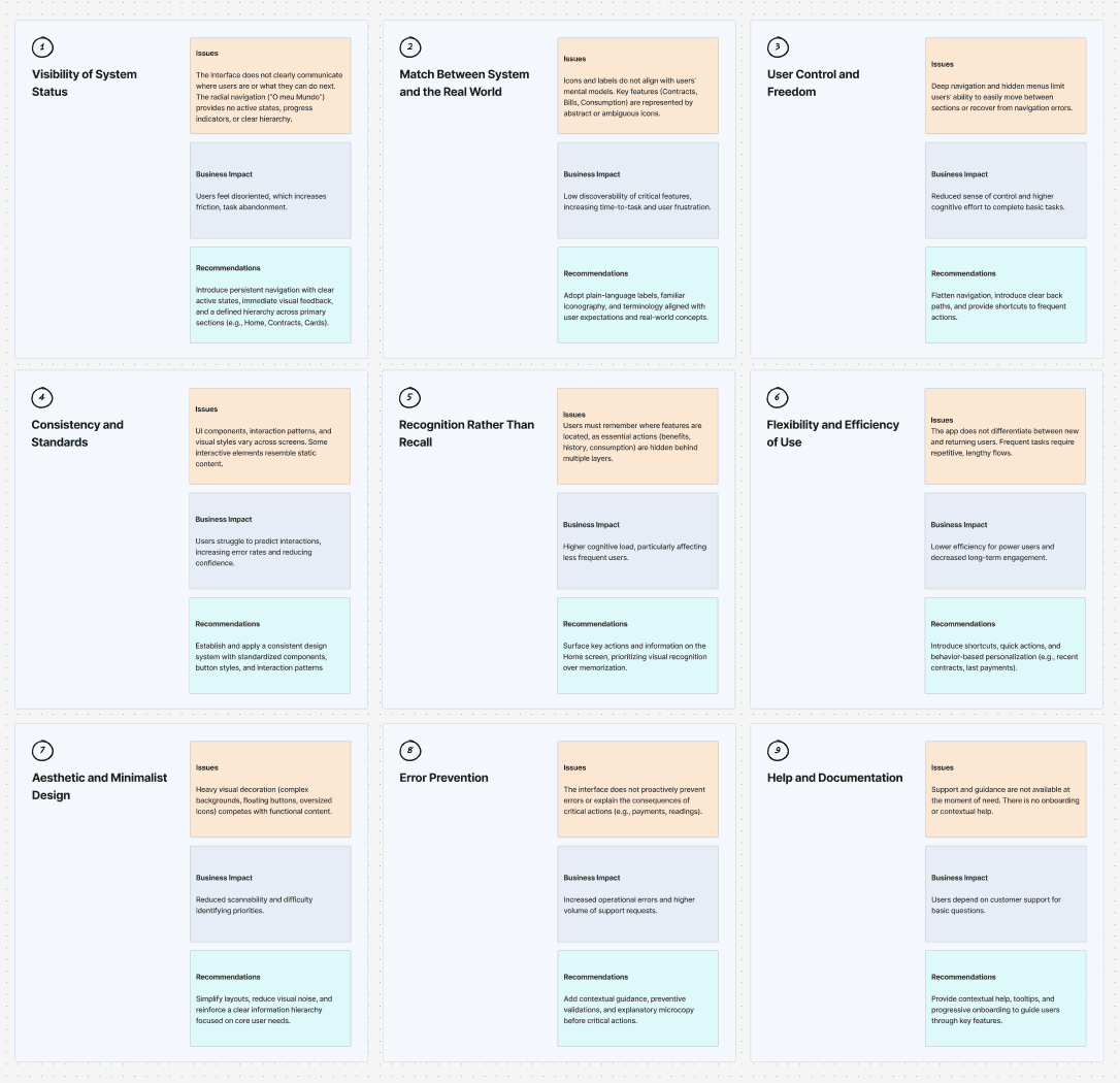
Heuristic Evaluation
I combined user feedback with analytics to confirm consistent navigation issues and drop-off points. With the Product Owner and Tech Lead, we mapped these findings to business priorities and backlog insights, then walked through the entire app in a Heuristic Evaluation.
Usability testing
Next, I conducted in-person Usability Testing with real users. The heuristic evaluation help me identify the elements of the design that I should target during testing because that I observing how they interacted with the app especially with the menu, contract and cards and where they encountered difficulties. To measure the effectiveness and efficiency of the experience, I applied key usability metrics, including: Task Success Rate, Time on Task, Task Difficulty Rating and Error rate.
Tasks
Validate whether users can find essential information independently, complete core flows with low friction, and understand the app structure without external support. These tasks helped validate the findings from the Heuristic Evaluation, and map opportunities to improve the overall user experience. Users performed three main tasks during testing:
Key Finding: Users are not discovering the essential features
The navigation structure was confusing and unintuitive.
Simple tasks required too many steps, creating friction at every stage.
Many users didn’t understand that Mundo Galp was a quick-access button.
The app felt unnecessarily complex for what it aimed to deliver.
Users frequently abandoned flows because they didn’t know where to go next.
These insights became the foundation of the design direction.
Usability test report
Bringing Clarity to a Complex Experience
With a clear understanding of the pain points and together with the team, I explored ways to simplify the navigation, reduce steps, and highlight the features that mattered most.
I sketched multiple layout options, reorganized the information architecture, and rethought how users could reach essential information faster. A major focus was turning the Mundo Galp app more intuitive and faster.
Solution
A Clearer and More Intuitive App
The final solution centered around clarity and simplicity, not just beautiful, but genuinely useful. Instead of showing everything at once, I started by redefining the information hierarchy I prioritised what users come to the app for: their balance, savings, wallet, cards, coupons. Now, the most important elements are immediately visible, giving users a clear sense of where to start.
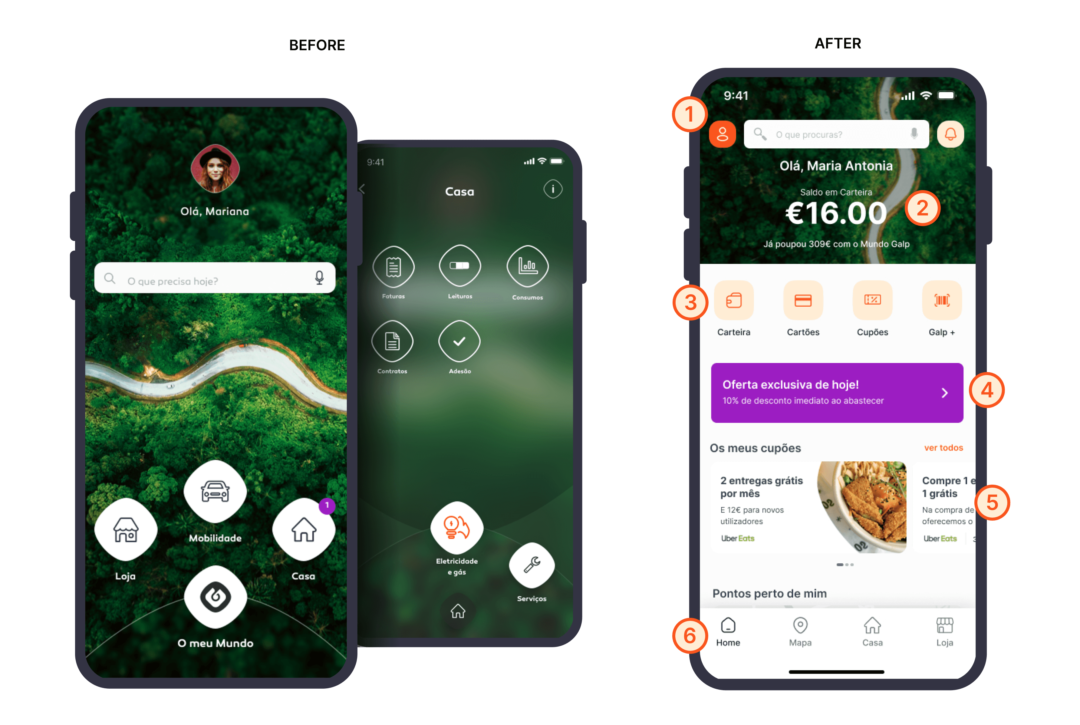
Compare the before and after to discover the improvements:
Lighter layout with a modular structure and well-defined visual hierarchy.
Introduced a global search and quick-access entry point at the top of the Home.
Data prioritized by frequency of use: savings balance, cards, coupons, and consumption.
The new Home highlights relevant user data current balance, accumulated savings, and active benefits reinforcing a sense of progress and encouraging ongoing engagement.
Visible shortcuts above the fold: Galp+ Card, readings, invoices, and offers.
Previously hidden deep in navigation menus, key functions like Wallet, Cards, Coupons, and Galp+ are now right at the first glance. Users can access what they need with almost no effort, reducing cognitive load and frustration.
Inclusion of dynamic offers and benefits that increase user engagement.
Before, offers and coupons were scattered or hidden. Now, a dedicated area on the Home presents daily deals, available coupons, and personalized benefits
Improved content hierarchy for Rewards and Coupons
Reorganised rewards and coupons into a structured, scannable section. This made benefits easier to discover, increased usage of discounts, and reduced frustration caused by hidden or overlooked rewards.
Navigation became simpler and more intuitive.
I introduced a bottom navigation bar with direct access. Fewer steps, less confusion, and a smoother journey through the app.
Simplified Header and Primary Navigation
Users previously struggled to orient themselves and find key entry points. The header was redesigned to provide quick access to profile, search, and insert a new contract, helping users immediately understand where they are and what they can do.
Consolidated Contract Information
Before, contract information required extra steps and interpretation. Now, centralised contract details into a single, scannable card. This reduced the number of steps needed to access billing and contract data, improving task efficiency and lowering user confusion.
Structured Information, Reduced Cognitive Load
Previously, important details were buried inside expandable sections. The new structure surfaces contract data progressively, improving readability and helping users complete tasks with confidence.
Visible shortcuts: Invoice, Readings, Benefits and more.
Promoted high-frequency actions into visible, tappable shortcuts.
This increased feature adoption, encouraged self-service behaviours, and contributed to a reduction in support requests.
Finally, we achieved stronger content density without overwhelming the user.
The old layout looked pretty, but offered limited immediate utility. The redesign balances useful information, actionable content, and well-spaced elements, creating a Home that is both practical and oriented toward real user needs.
Impact and validation
What did we archived?
After implementing the redesigned experience delivered measurable business impact by improving usability, reducing support costs, and increasing engagement through a clearer and more intuitive product experience.
Reflection
What I learned
The simplest designs hold a lot of complexity.
For users, the best designs feel natural. My work begins where things get complicated. I break down systems, identify what really matters, and rebuild flows so they feel simple and intuitive.
Move Quickly, Learn Faster.
We built, tested, and refined continuously. By testing early and often, we gathered insights that improve the product.


