Reducing cognitive friction in a multi-service energy platform.
Mundo Galp combined fuel, home energy and electric mobility services into
a single app, but users struggled to complete key actions due to unclear navigation and poor information architecture.
B2C
UX Design
Energy
Website, iOS and Android
My Role
UX Designer
Focus
UX Research
Information Architecture
Behavioral UX
Team
Product Owner
Scrum master
UI designer
Developers
Q&A
Context
Overview
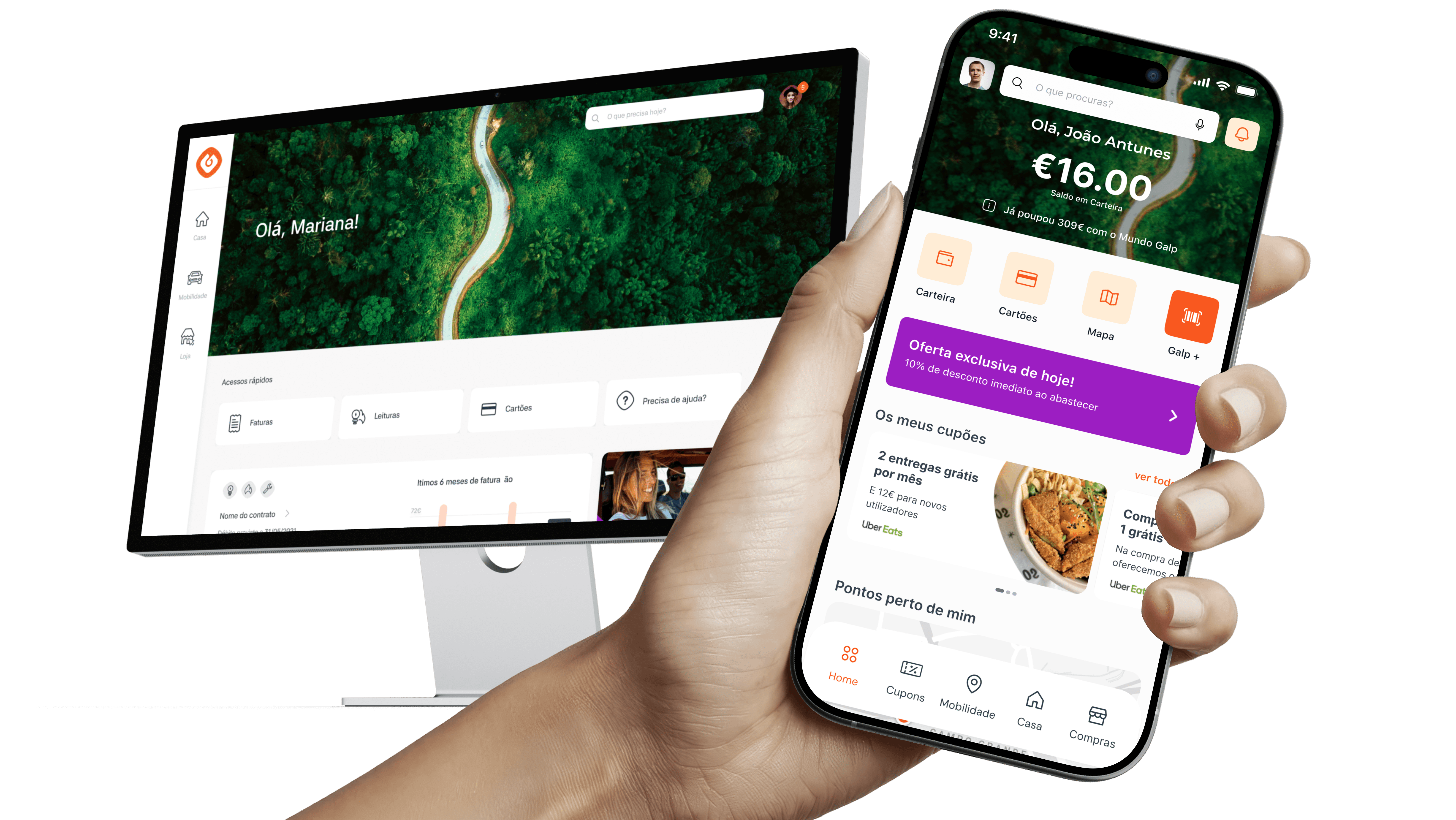
Mundo Galp unified fuel, home energy, and electric mobility services into a single app. As the platform expanded, users struggled to find features, complete tasks, and navigate between services.
Stakeholders initially proposed small UI improvements. Research revealed the real issue was the product's information architecture.
Root cause: The architecture was built around just business logic, not user mental models. Navigation relied on recall, not recognition.
Results:
↓45%
Time-on-task metric for critical tasks
↑80%
in user retention
↓30%
usability-related support tickets
What I help?
My Role
Sole UX Designer. Led usability research, behavioral analysis, information architecture redesign and validation. I worked closely with Product and Engineering teams to align user needs with business priorities and drive decision-making through evidence.
Problem Statment
The challenge
Stakeholders initially believed the solution was straightforward: improve a few screens, adjust visual hierarchy, and make small navigation refinements.
The expectation was that incremental UI improvements would resolve user frustrations without requiring significant product changes.
Before moving forward, I wanted to validate whether those assumptions reflected actual user behavior.
Business Problem
the new plataform was experiencing high drop-off in critical flows and an increase in support requests, showing clear friction in key user journeys.
User Problem
The experience was causing cognitive overload and recognition issues, forcing users to “think too much” to complete simple tasks.
Process
Discovery
Through usability testing (7users), behavioral analysis and Google Analytics data, a different story emerged. The research made one thing clear: improving individual screens would not solve the underlying problem.
Key behavioral insights
Ambiguity effect
users avoided interacting with elements that were not clear (e.g., menu)
Decision paralysis
too many options and unclear hierarchy made decision-making difficult
Recognition vs Bias
users could not recognize navigation patterns and had to remember where to go
Usablity testing - Key Insights
High time to return to the homepage (≈1 min)
The menu was not recognized as a navigation element
Difficulty finding key features (contact and cupons)
Dashboard was hard to scan and understand
User journeys included unnecessary steps
Contraints
Some trade-off
Initially, with a roadmap and some stakeholder resistance to UI changes.
I tested a low-effort fix first (menu redesign). Usability testing with 11 stakeholders proved it wasn't enough. The structural issue remained.
Roadmap constraints: predefined product priorities and roadmap limitations
Stakeholder resistance: internal resistance to major visual changes
No existing Design System: need to work within existing visual and structural limitations without a design system
Goals and metrics
Turning research into strategy
Research challenged the original stakeholder assumption. The original assumption was that users needed a better interface. The evidence showed they needed a better structure. Rather than redesigning isolated screens, I proposed rethinking the platform's information architecture and navigation model.
Aligning stakeholders
To gain alignment, I translated research findings into business risks and user outcomes. Rather than focusing on design preferences, I demonstrated:
Where users were getting lost
How navigation issues affected task completion
Why existing patterns increased support requests
The limitations of a screen-level redesign
By grounding conversations in user evidence and measurable impact, stakeholders aligned around a broader solution.
Result
The solution and strategy
The redesign focused on reducing cognitive load and improving discoverability across the entire experience. nstead of reflecting internal product structures, the new architecture was designed around user goals and mental models. The result was a more intuitive experience that helped users move through the platform with greater confidence and less effort.
What I changed
New information architecture
Reorganized features around user tasks, not business units. Reduced navigation depth. Made task relationships visible.
Before
Business-driven structure
Fragmented journeys
High navigation depth
Hidden task relationships

After
Faster orientation
Predictable navigation
Lower interaction cost
Scalable ecosystem structure
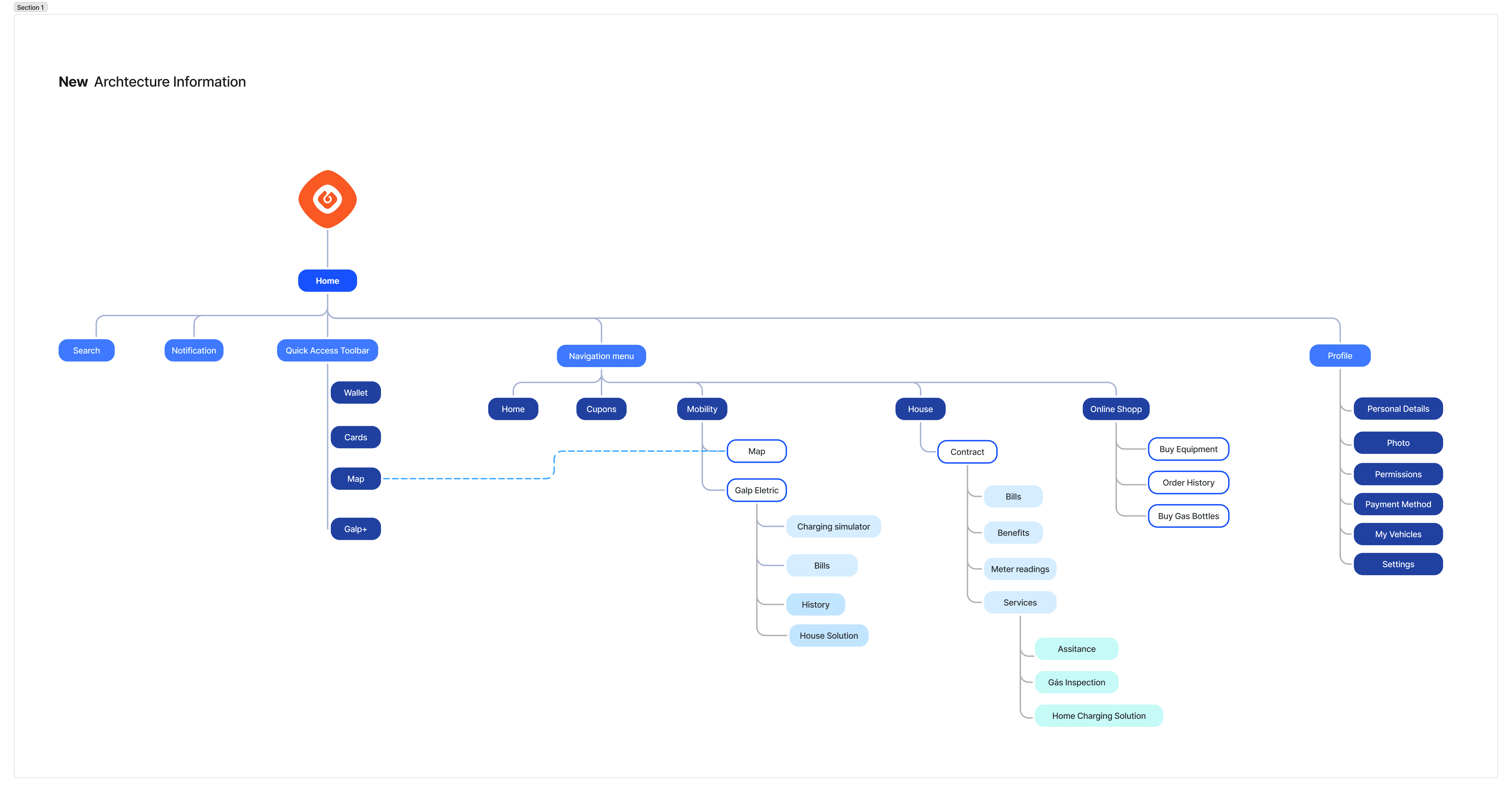
Bottom navigation bar
Replaced a radial nav model with a standard bottom bar. Applied recognition over recall.

Redesigned Dashboard
Key info (wallet balance, savings) surfaced at the top. Progressive disclosure reduced cognitive overload.

Impact and validation
What did we archived?
The redesigned experience was tested with users to evaluate whether the new structure addressed the issues identified during discovery.
Participants completed tasks faster, navigated with greater confidence, and required significantly less guidance.
The new architecture reduced friction across key journeys and improved overall usability.

Impact
The redesign transformed a fragmented multi-service experience into a more intuitive and user-centered platform.
Beyond the metrics, the project shifted organizational understanding of the problem. What started as a request for small interface improvements became a strategic redesign grounded in research and behavioral evidence.
Improve mobile user experience
Impact
28% increase in task success rate during usability testing
Reduce drop-offs in critical flows (contract and cupons)
Impact
18% increase in completion rates for critical user flows
Reduce support demand caused by usability issues
Impact
40% reduction in support tickets related to difficulty finding features
Reflexion
What I learn.
High-impact UX doesn't require a full redesign — it requires focus on the right leverage points
Rapid validation helps identify systemic issues before significant development investment.
Behavioural evidence helps align stakeholders and shape product strategy.